Often one of the most overlooked aspects of any photographer’s workflow is their color management system (or lack thereof) that they have in place. Every screen we view or edit our images on should be color accurate, otherwise we don’t really know what the true effects of our post-processing adjustments are really doing to our images. If we end up posting those images to Instagram…or worse, sending poorly edited images to a client, it can be really embarrassing. That, in its core, is what Color Management is all about…maintaining color accuracy throughout all of the devices you use in your workflow to create, process and view your work as a photographer.
When it comes to Color Management, I am going to focus most of my attention to my Dell XPS Laptops for this guide, using them as an example in each of the main sections.
Color Management Breakdown Video
I put together this video on IGTV that breaks down the core elements of what Color Management is and why it is important. Give it watch and then follow along with this guide!
The Core Concepts of Color Management for Photographers
At the base of every good color management system, there are four core concepts that photographers should try to master…
1. Understanding color profiles
2. Using high quality/color accurate displays
3. Controlling light within your work environment
4. Learning how to calibrate your screens using a colorimeter
Understanding Color Profiles
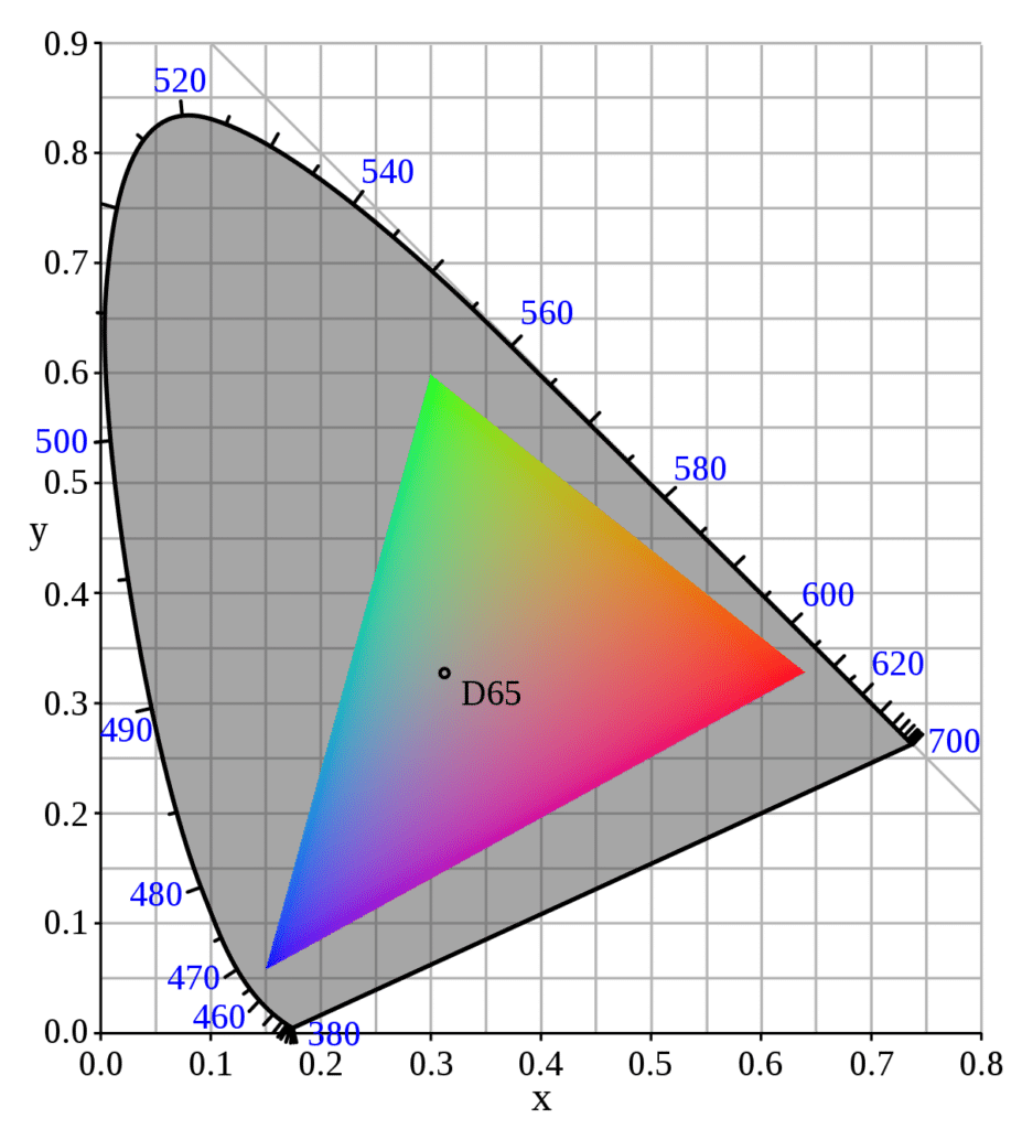
The best way to understand color profiles is to think of them as representing the number of colors that are potentially visible on a digital display. However, there are actually two elements to this. First, we must choose the right “color space” or “color profile” to work in with our images and then make sure that the display or monitor we are using is capable of actually displaying all of those colors. Our digital displays are made up of a mixture of Red, Green, and Blue variations (otherwise known as RGB) which ultimately has the potential of 16,777,216 possible color combinations. Color Profiles come into the mix to represent different percentages of those possible colors. As a photographer, I need to pick the right color profile to work in when it comes to processing my images, depending on what my needs are.
sRGB
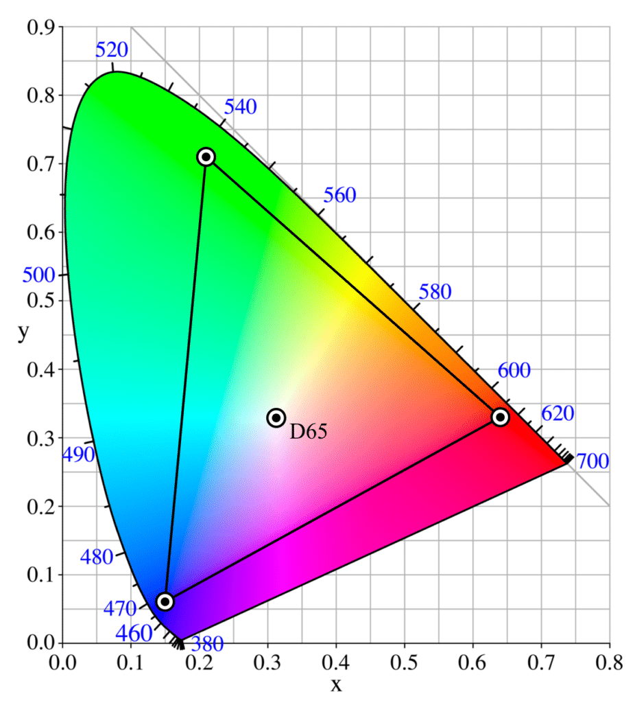
sRGB is by far the most common color profile, representing 99% of what you see online and in the digital space. It however also contains the smallest amount of total colors from the four main color profiles we are focusing on in this video. But if the vast majority of your images end up in a digital format anyway, you might want to consider working in sRGB.
Adobe1998
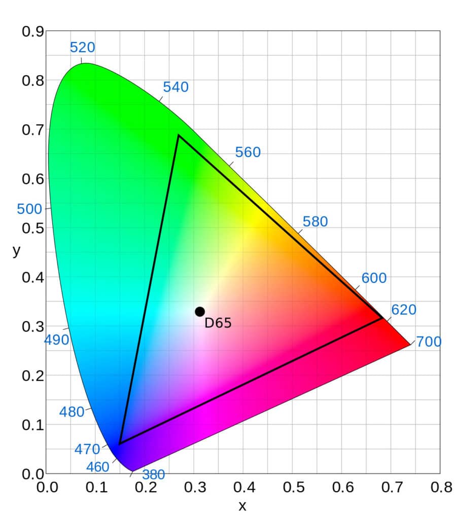
Adobe1998, the next color profile, allows for a wider range of colors and it is mostly used when it comes to printing images. Think of it this way, with a larger color profile like Adobe1998, you could potentially see more variations per color, so a wider variety of the different shades of blue for example, which could be very important when printing an image to display in a gallery or delivering a physical print to a client.
DCI-P3
Next we have DCI-P3, which has been used for decades in the film industry, offering a slightly larger color spectrum over sRGB. It has growing in popularity recently because of it’s use within certain phones and tablets in the mobile space.
ProPhoto RGB
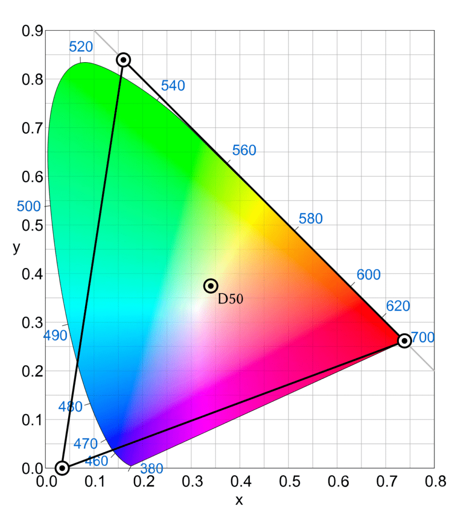
Lastly, we have the ProPhoto RGB color space which offers the widest color spectrum of them all. In fact, it covers so many different variations of color that the human eye can’t fully see them all. So why would you choose to keep your images in this color space? Mostly to future proof your color management system against any future advancements in the industry.
Using High Quality Color Accurate Displays
One of the most important elements of a good color management system is found in using the right kind of displays or monitors to not only view but process your images as well. After all, what is the point of creating a color management system if the laptop or monitor you are using isn’t capable of actually showing you accurate colors? This is one of the main reasons that I have been a big fan of Dell’s XPS line of laptops. They are powerful, portable, and easily have some of the best displays available in the industry. So let’s take a look at the latest XPS releases to see how they differ when it comes to handling color.
Dell XPS 13 & 13 2:1
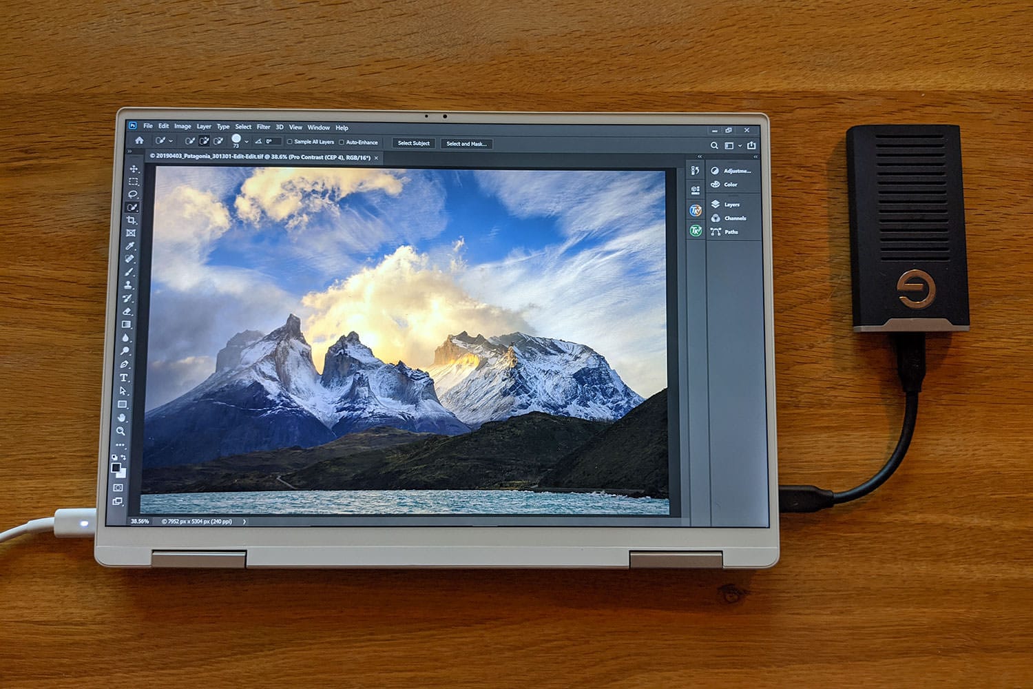
Starting off with the XPS 13 & XPS 13 2 in 1, Dell’s most mobile-friendly pair of laptops have the same bezel-less infinity edge display technology as their larger cousins, but they don’t offer the same wide color gamut coverage. Why? This mostly comes down to the focus on mobility with these 13” laptops. This of course doesn’t mean that the XPS 13 isn’t color accurate, as they do cover 100% of sRGB and 90% DCI P3, but a discrete GPU and wide color gamut support generally comes at the cost of weight, size, and power consumption. When I need a small, lightweight, and powerful laptop for an expedition, I am often reaching for XPS 13, especially if most of that content will be living in the sRGB color space online.
Dell XPS 15 & 17
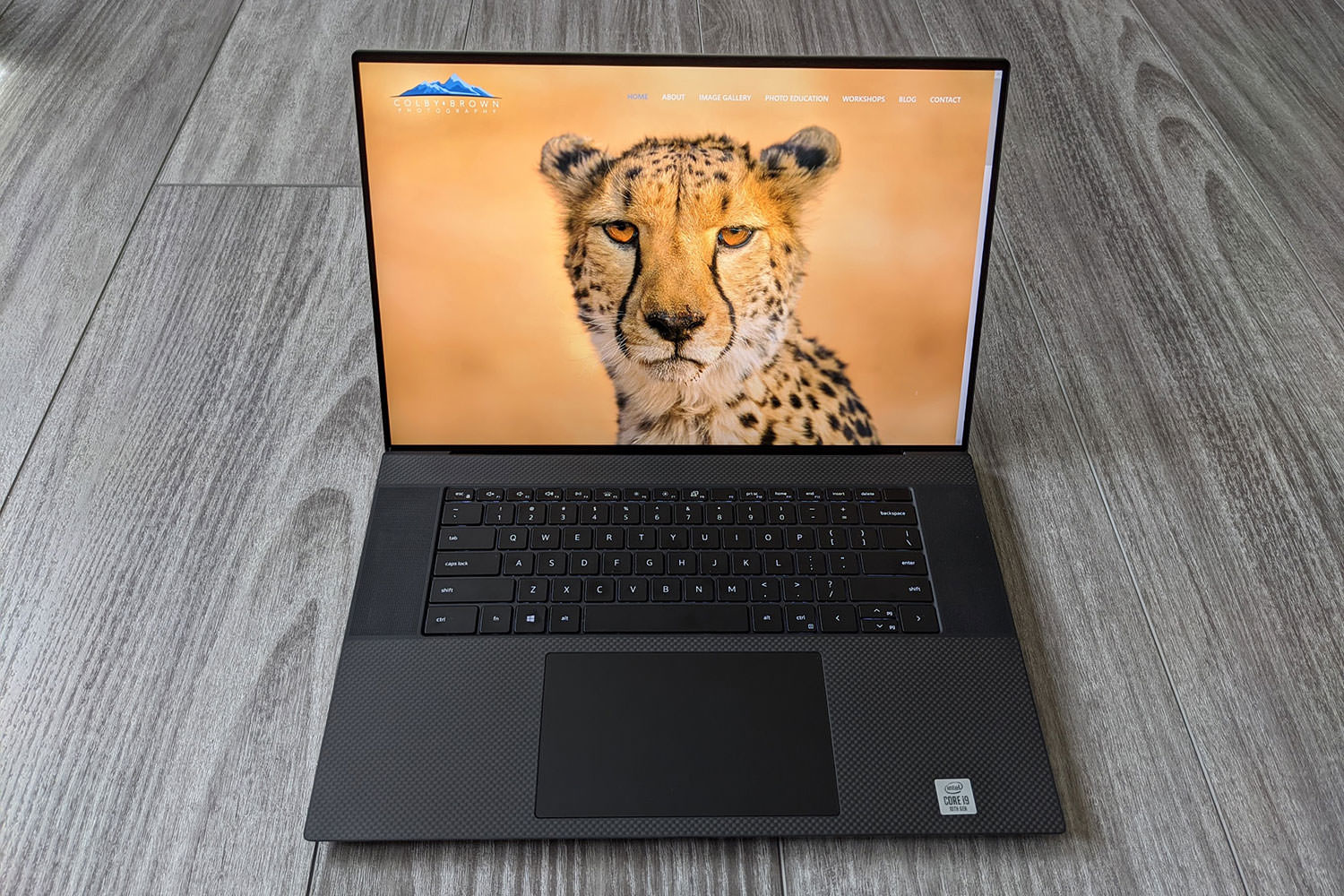
Next up we have the XPS 15 and 17 laptops. Both of these laptops not only have discrete GPUs inside but wide color gamut support as well with their 4k infinity-edge displays. This means they have the power and battery life to not only show you 100% of the sRGB color space, but also 100% of the Adobe1998 color space for fine art printing and 94% of the DCI-P3 color gamut for video work. While the XPS 13 is focused on powerful mobility, the XPS 15 & 17 were built with content creation in mind.
Powerful processors, large amounts of RAM and discrete GPUs help push these laptops to be some of the best options in the industry for photographers. If I am doing any video work on a trip or know that I need to do some heavy lifting when it comes to processing images, I often reach for my XPS 15 or 17 (REVIEW).
Your Work Environment
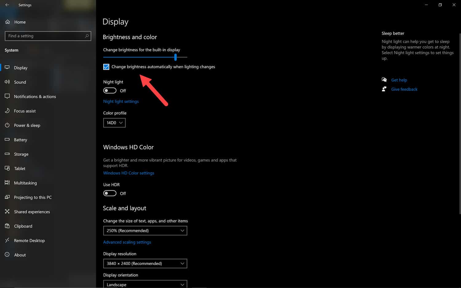
Before I walk you through how I calibrate your laptop or monitor, we should talk a little bit about your work environment. Why? Because the lighting you find around your device can have an effect on not only how you perceive color on your display, but contrast and general brightness as well. For example, if you are working in a situation where sunlight is coming in from a window behind your laptop that is a completely different viewing experience than if the light is coming from behind you and hitting the display. With your XPS laptop, there is a built in Auto Light Sensor (otherwise known as ALS) that aims to help with this by automatically adjusting the brightness of the display depending on your work environment. With the current XPS models, this however only has to do with brightness as it can’t adjust for white balance or color tonality, which is a good thing in my mind as I prefer to control color and tonality on my own. Regardless, we should turn off this feature when calibrating our displays by right-clicking on your Windows 10 desktop, go to “Display Settings” and unchecking the “Change brightness automatically when lighting changes” box at the top of the window that popped up.
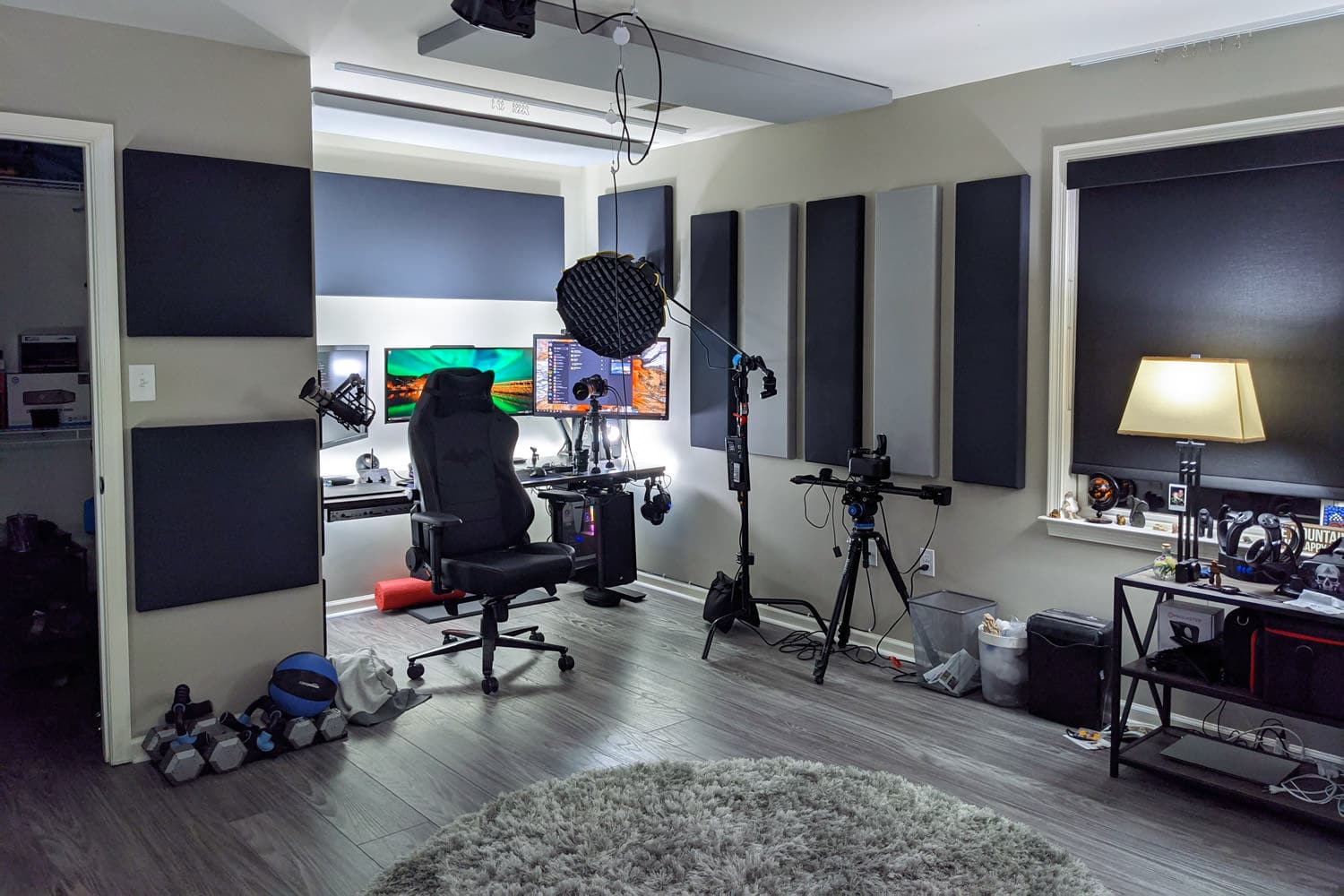
For the best results when it comes to both color calibration and viewing, you will want to try to work in a controlled lighting environment. Here in my studio at home, that is very easy to do with my custom-built PC behind me or even with my XPS laptops. But when I am traveling around the world, this is something I need to take into account. If I am working in a hotel, for example, I will almost always pull down the shades of any windows to get an even amount and tone of light within the room before I try to calibrate the display. Regardless of where you might find yourself, try to find a place where you can control the light entering a room before you begin to calibrate your display or monitor.
Why Do Displays Lose Color Accuracy Over Time?
This is easily one of the most asked questions I get when it comes to Color Management. The truth is that all laptop displays and desktop monitors lose their accuracy over time because of a multitude of reasons. This can happen because of excessive use, updates to the core software elements to a given operating system, driver updates, and of course, user error when it comes to adjusting settings in applications that deal with color.
Applications That Handle Color & How To Avoid Them
The most common issue when it comes to unwanted color changes on a given system usually comes down to a photographer trying to adjust color settings on their own rather than relying on the software that comes with their colorimeter. As an example, let’s talk a bit about the different options one has when it comes to applications on your XPS laptop that handle color…and more importantly…how to avoid messing around with the settings in any of them.
Dell Cinema Color

Dell Premier Color
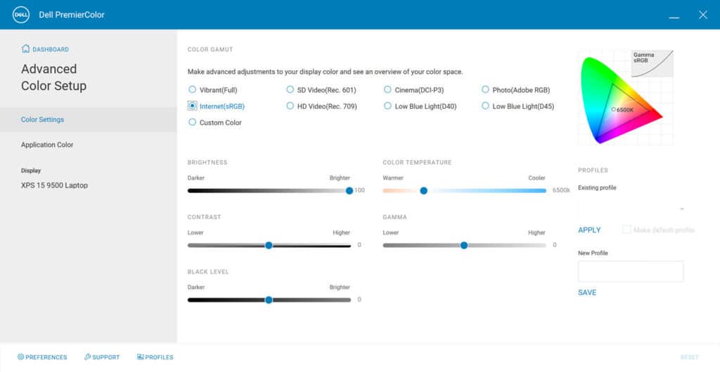
Next we have Dell Premier Color, which was developed with content creators in mind. This app is best used if you find yourself needing to move between different color spaces, such as between sRGB to Adobe1998. If you are editing an image you plan on printing, you might be working in Adobe1998, but after you are done, you plan on sending that photo to Instagram first. Premier color can help you quickly switch to sRGB to see what the image will most likely look like. It is important to note that this app will only be found on the XPS 15 and 17 inch models because of their wide color gamut support.
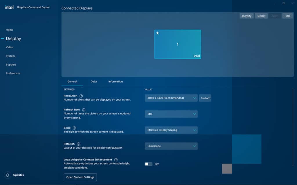
Intel Graphics Command Center
Now because each of these XPS laptops have integrated Intel GPUs built into their motherboards, they also come with the Intel Graphics Command Center. Here you can make adjustments to the display when it comes to color, contrast, resolution, refresh rate and more. I recommend you stay out of this program and let Windows and the color calibration software you choose handle most of this, but more on that soon.
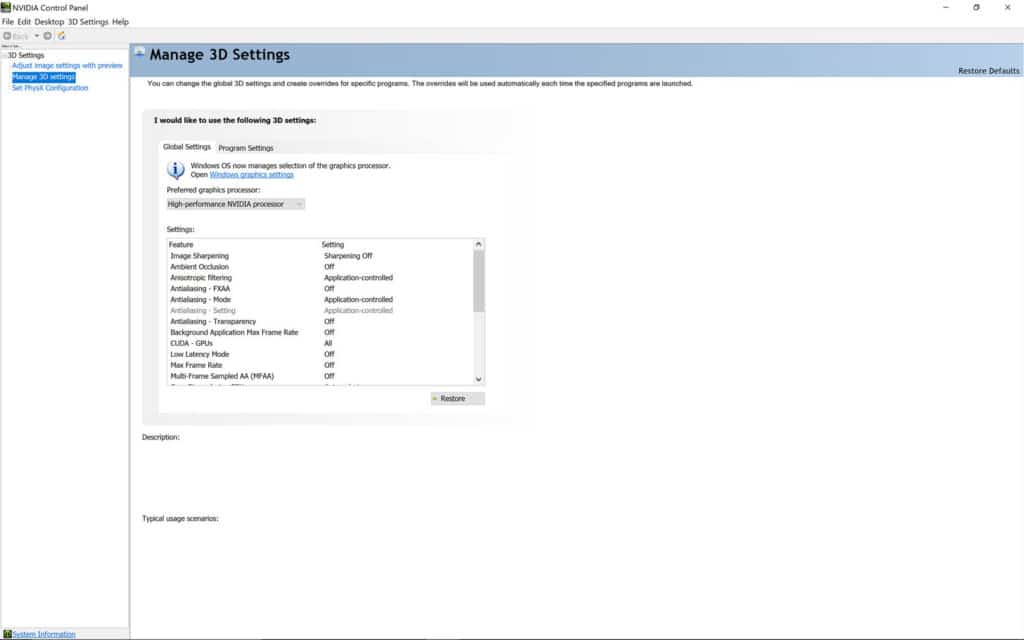
NVIDIA Control Panel
Lastly, the XPS 15 and 17 laptops both have NVIDIA based discrete GPUs, which means they will come with the NVIDIA control panel. Ultimately this app has much less to do with color and more to do with GPU processing power and functionality, settings that are mostly geared towards gamers who use these laptops. As a photographer or cinematographer, there isn’t much in here for you.
However at the end of the day, if you find yourself in a situation where you can’t get the colors to look right on your XPS laptop because you have jumped into these apps, consider uninstalling Dell Cinema Color & Dell Premiere Color and re-run your color calibration software.
What is a Colorimeter?
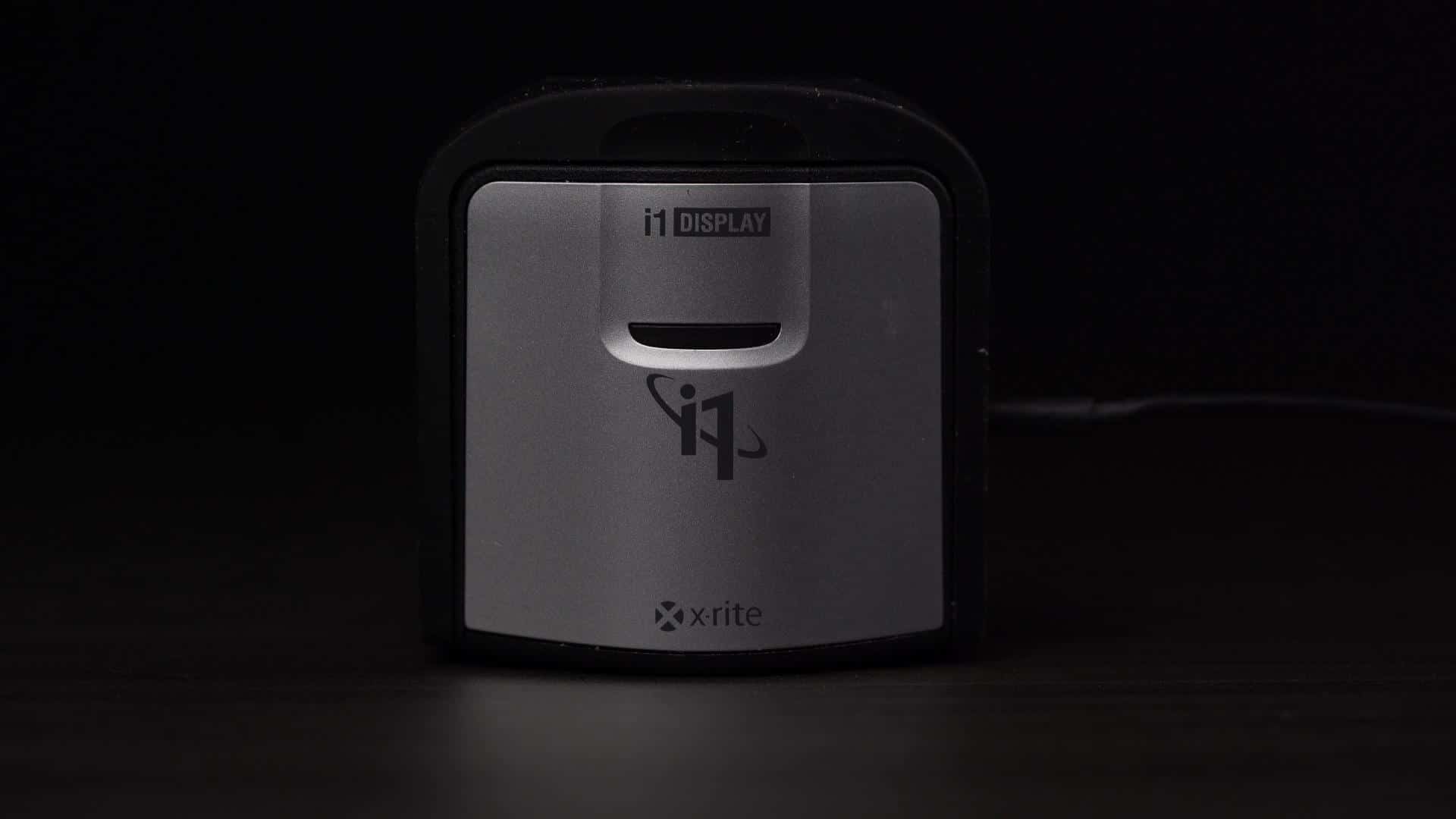
When it comes to learning how to calibrate your displays, having a colorimeter is mandatory. But what is a colorimeter? It is essentially a device that you hang over your screen so it can check the accuracy of the colors being displayed. When paired with it’s own software, it can be used to help calibrate your display to show the most accurate colors possible. The two most popular companies that make colorimeters for photographers are X-Rite & Datacolor. Personally, I have used the X-Rite i1 Display Pro colorimeter for years and I have yet to be disappointed with the results.
Step by Step Guide for Calibrating Your XPS Laptop
Now let’s talk about calibrating your XPS laptop. For this short guide, I will be using my X-Rite i1 Display Pro colorimeter and pairing it with the X-Rite i1 Profiler software. This process will be the same for any laptop or display out there on the market.
Step 1
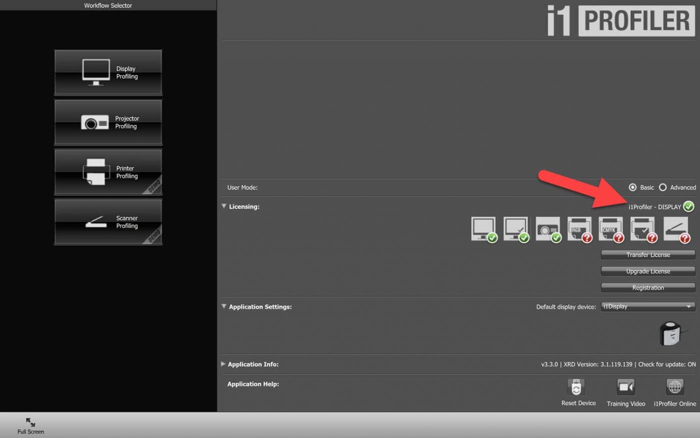
Step 2
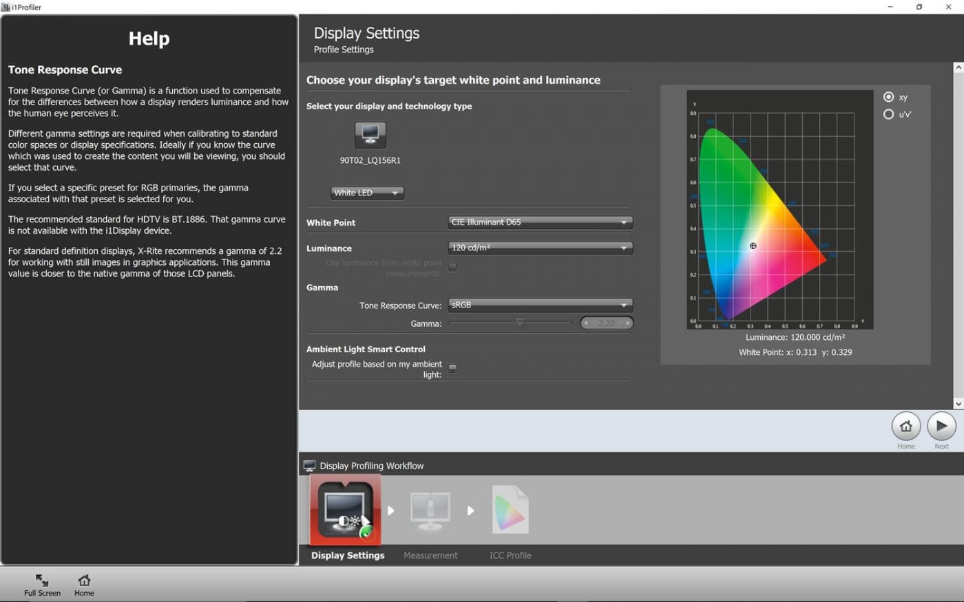
Click on the Display Profiling button on the left to start the process. On this next page we have a few options worth discussing. First is the kind of display we are calibrating, represented by the Display Type drop down box. This should automatically select White LED, which is the right choice for these XPS laptops. Next we have to choose our White Point, which determines how the color White will appear on the display. The industry standard here is D65, which is what we want to leave this at. Now we move to Luminance. It is here where we can make adjustments to the amount of brightness we want to have our display work with. The two main numbers you will want to keep in mind are 80-100 if you want to calibrate your screen for printing or 120 if you plan on mostly sharing your images online or in the digital space. Next let’s adjust our “Tone Response Curve”. Here we want to move from “Standard” to sRGB. Once that is done, we can click on the “Next” button on the right of the screen.
Step 3
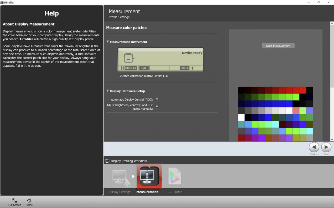
Now on the Measurement page, we will want to make sure to uncheck the checkbox for “Automatic Display Control” or “ADC” as I find that this setting occasionally crashes the application on my XPS laptop. Next we need to hit the “Start Measurement” button and follow the instructions to put the i1 Display Pro on the XPS display properly. Once it is ready to go, you will want to make sure that only the “Brightness” box is checked on the “Profile My Display” page that pops up before hitting the “Next” button so that it can begin that calibration process.
Step 4
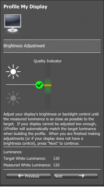
The screen will flash a wide variety of different colors as the i1 Display Pro along with the software begins to verify they are being displayed accurately. However, soon after starting it will pause momentarily, allowing you to manually adjust the brightness of your XPS laptop. In this case, I want to get it as close to 120 as possible before hitting the “next” button and continuing with the calibration process. This entire process should take just a couple minutes.
Step 5
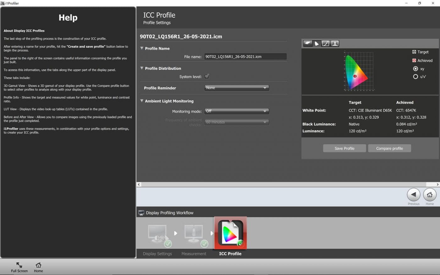
When it is finished, the software will ask you to close the i1 Display Pro before allowing you to hit the “next” button. Now we find ourselves back on the “Measurement” page where you can once again hit the “Next” button. Now it is time to label our new color profile that has any of the micro-adjustments to color and tone that were found during the calibration process. I personally like to name them for the date in which the display was calibrated, so that I always know my last calibration was. I then hit “Save Profile” to save and apply the profile to my XPS laptop. On the right hand side you can now look at the color space that was saved and even do before and after comparisons to see what changes were made.
Color Calibration Over Time
Now that you know how easy and simply the process is to calibrate your display, you have to decide just how often you want to check its accuracy. For some, this could be once a week, month, or even a season. While there is no wrong answer here, I personally opt to calibrate all of my displays at least once every two weeks, just to be sure. That way you never have to wonder if the colors you are looking at on your laptop are accurate or not.
*Sponsored by XPS


